
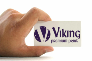
We print thousands of business cards each week. A business card is one of the most important and cost-effective marketing tools a business has. It helps people remember you after you have left and it gives them a way to contact you in the future. Too often though, small businesses miss the opportunity to make a great impression with their card. If someone has an unprofessional or poorly looking card, it is likely to get thrown in the trash.
You can make it an effective marketing tool by avoiding some common mistakes:
Mistake #1: Having a card that doesn’t stand out but that blends in with all the rest
The great majority of business cards out there leave no real impression and soon become forgotten. Leave someone with a card that looks great, feels great and clearly defines what your business does – and you and your card won’t soon be forgotten. There is no reason for an unattractive or unprofessional-looking business card.
Mistake #2: Having a “mystery” business card
When someone looks at your business card, can they tell immediately what your business does? If not, you are not likely to get as many calls or referrals. Mystery can be intriguing but not on a business card.
Mistake #3: Presentation of a poor-quality card
I frequently come across “home-made” business cards. People try to print them themselves or order them from some cheap online place. Initially they may look alright – good use of colors, fonts and a pleasing layout. But often times when held in your hand it is feather-light and has other quality issues, such as perforations around the sides or other defects. The lesson here is: Don’t skimp on money when it comes to business card. You want to have good card stock, print that doesn’t bleed from a drop of water, an embossed logo, and the card should feel substantial and pleasing to the touch.
A poor quality card implies a business that will have poor quality products and services. Rather than attracting business, this type of card would most likely repel prospective customers.
Mistake #4: Print that is too small
Does your business card have a font size so small that you need to hand out a magnifying glass in order for it to be read? Beware of this practice. You may be able to cram more information onto the card with a small font, but what good is it if people can’t read it? Since 95 percent of the population aged 35 or older need reading glasses, a good guideline is to use a type size no smaller than 7-8 point. Your name point can be a little larger; i.e., 9 point, and the company name usually looks good at about 12-15 point.
Mistake #5: Using an oversized card
The traditional and standard 3.5 by 2-inch business card works well. Anything bigger will not fit in wallets or most business card holders. Chances are it will end up being filed in the trash bin. You may think that an oversized card helps you stand out but many people find it annoying and inconvenient.
Mistake #6: A cluttered card
An appealing business card does not contain every detail of you or your company. Too much print looks busy and terribly unprofessional. Simple is best. Sort out the information and keep only what’s totally necessary for someone to know your name, your company, what you do, and why they should use you – but don’t skimp on your contact information. You want to be easy to reach.
Mistake #7: Not providing a unique selling proposition
Many businesses miss the golden opportunity of utilizing their business card to its full marketing potential. Your card should state at least one very powerful reason that a customer should do business with you. For example, an auto service center’s business card I have reads in part, “complete automotive repairs” and “all work fully guaranteed.”
Mistake #8: Inadequate or poor use of color
Spice up your business cards with some color. You would be surprised what a difference it makes. For example, just as restaurateurs use the color red for its appetizing quality, the judicious use of red in a business card is very visually appealing. Avoid the common mistake of grey print on a white background – it lacks contrast and the print is difficult to read.
On the other hand, don’t make the mistake of color-overload. Too many colors that don’t complement one another will make the card look busy and will detract from the content of your card.
Mistake #9: Not including an email address and website on your business card.
Many people use email instead of making phone calls. Often times people want more information about your business without a sales pitch. They go to your website and read about you there. They will also look around on social media for information. If your email address and website are missing from your card, you may be missing out on business.
Mistake #10: Cards that don’t get distributed
What good is having a box full of business cards if they’re just sitting there collecting dust? It would serve you and your business better to apply the old axiom, “Use it or lose it.” What can you lose? Business.
Always have a supply of your cards wherever you go. Give them out when appropriate, and while you’re at it, don’t hesitate to give out more than one. Invite people to pass the extras along to others who might need your service. You might be surprised at how often this can result in a referral!
Not sure what to do? Let us use our expertise to help you make a great first impression with your business card. We can bring your design to life or create something special from our fantastic design team. Contact us at 602-241-0833 or email us at sales@vikingpremiumprint.com so we can help!